A fresh coat of paint.
NOTE: I started drafting this post 3 months ago. THREE! And am just now revisiting to finish and publish. We’ve been busy over here, and have so many amazing client success stories to share and case studies to tell. From global rebrands and photo shoots, to eCommerce and website launches, all the Bluebirds have been busy. So much more coming soon!
________________________________________
While Bluebirds Marketing supports branding efforts for companies of all sizes, a recent, closest-to-home rebranding was for itself. In addition to a commitment to invest in myself personally and professionally (see recent blog), it was just time for a fresh coat of paint.
When I launched Bluebirds Marketing several years ago, I moved forward with a visual that literally reflected the company name. And I loved the result. My message, values, and identity reinforced that visual. But it was time for something new.
I work with loads of talented freelancers, consultants, graphic designers, and photographers every day. I was thrilled to have them work alongside me for me. The trust was already there and I knew I was in talented hands.
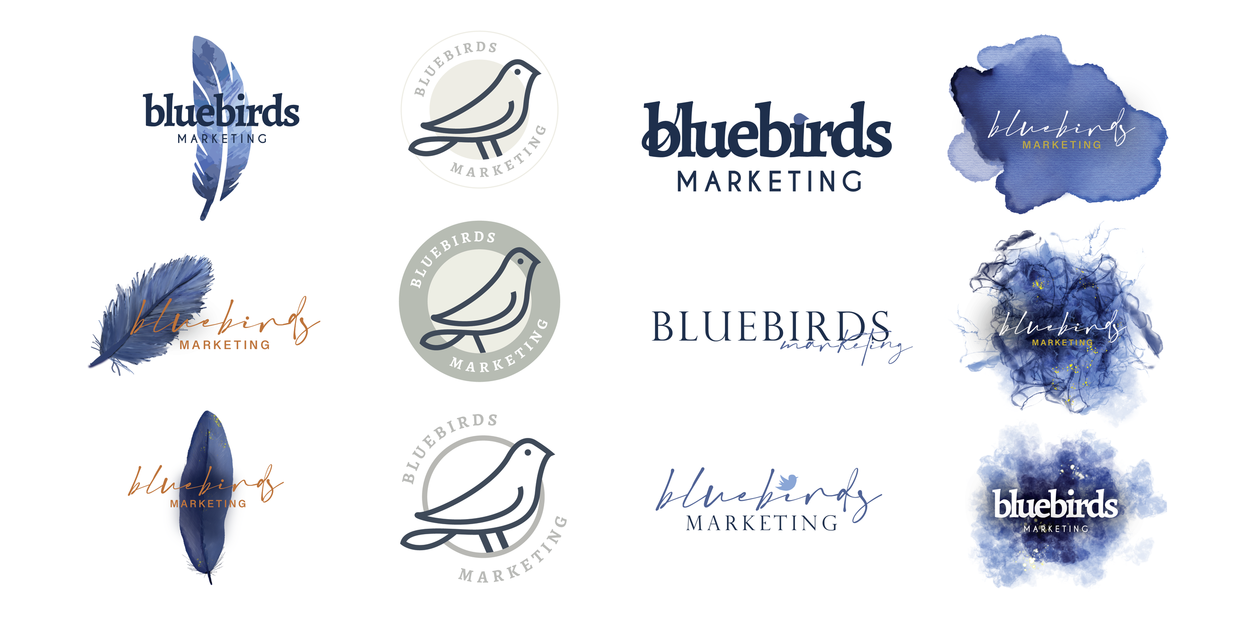
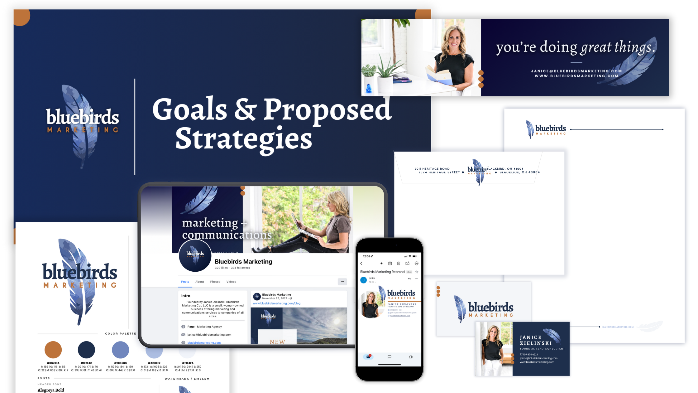
It started with brainstorming with one of my go-to graphic designers. We worked through what I like about the current brand, and what I was ready to let go of. Leaning on a trusted advisory group of experienced marketing and communications experts for feedback, we went through several rounds of concepts. The outcome (seen across the Bluebirds website) speaks for itself. True to me, my brand, and my vision. You can see an overview of the process with some of these visuals.
While this showcases just a few iterations, it includes some of my favorite concepts. I loved the badge with the illustrated bluebird in the center. This was a frontrunner for a long while. I also loved the watercolor splashes. It offered something creative and artistic that I felt like I wanted and needed. The font treatments offered subtlety and simplicity. But I kept going back to the feather. We do a lot of writing and messaging work for clients, and this represented the company name and offered an homage to the quill. We were able to play around with the watercolor effect within the feather. Once the colors were right, the feather was positioned correctly, and the fonts just right, I knew it was where we needed to go.
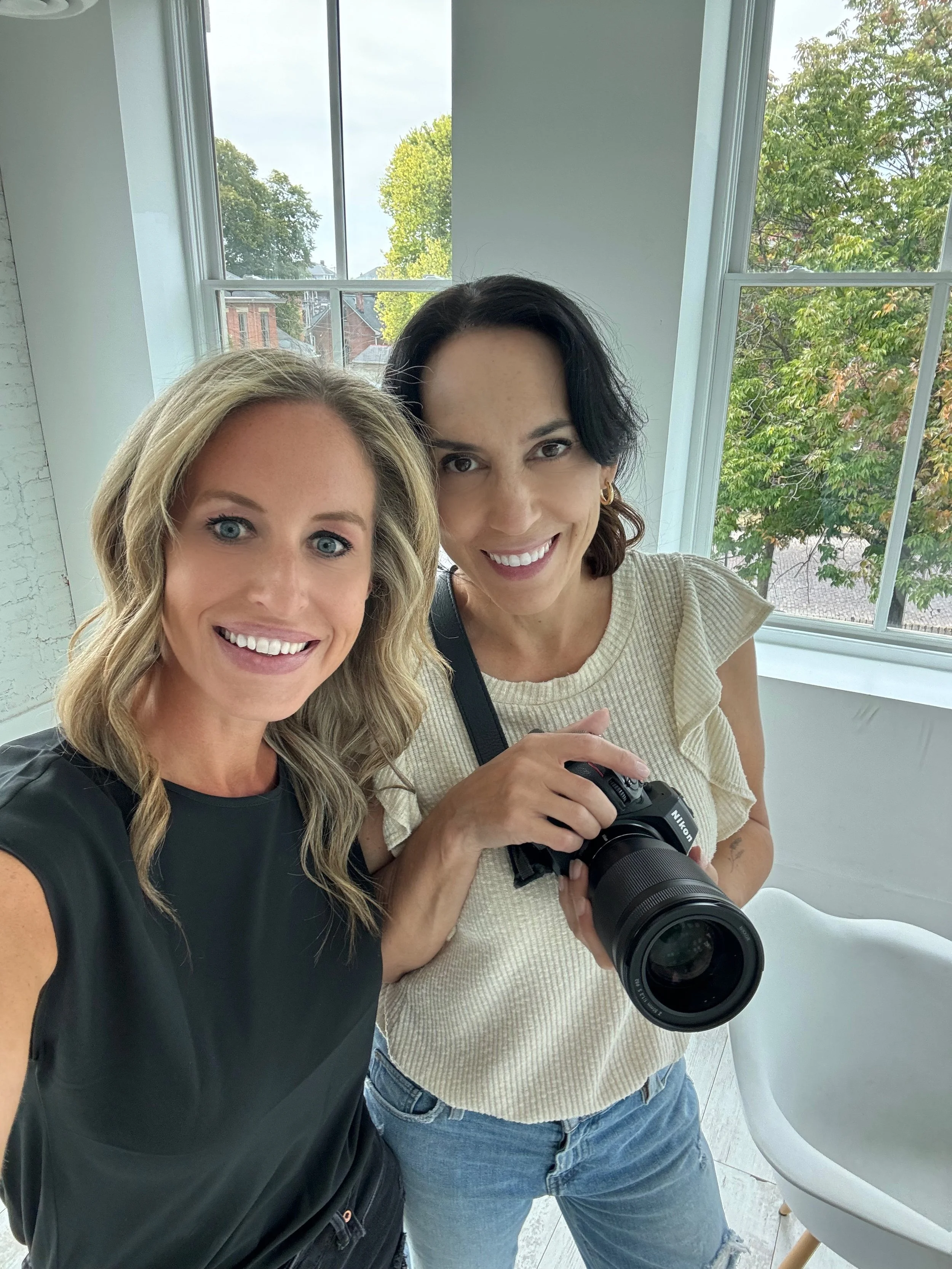
True to my craft and a passion area for me, I knew photography also needed to be updated, so I scheduled a website photo session with my most trusted and talented photographer. She delivered. The result was a gallery of photos that I can utilize for website, social media, proposals, and more. While they are “me-centric,” so is Bluebirds. It’s challenging to get photos of any Bluebirds in action, because we’re so heads-down in the work. Definitely an ongoing effort, and one I want to make happen in the immediate future. From speaking engagements, to meeting facilitation, to photo shoots, I’m eager to add to the photo library for Bluebirds with this approach. In the meantime, I’m so grateful for polished photography to represent the investment we make in ourselves. Back to that commitment I made. ;)
So many individuals and companies default to “we need a new logo,” when in fact, they need a new brand. It’s critical to start from the inside out: all the messaging and then the assets. In that order. With refined messaging in how I/we talk about Bluebirds, I now have a fresh visual to showcase evolved work and strategies.
With these internal elements refreshed, and several of the external elements drafted, it was time to reveal. I have clients that have grand reveals for their hundreds of employees, customers, etc. With the subtlety of this brand refresh for Bluebirds Marketing, I opted for a slow, but purposeful rollout. This fresh look and feel is exactly what Bluebirds needed. And I’m so proud of it! Kudos to my graphic designer, photographer, and advisory group for bringing it to reality.